

Have you ever looked at a movie poster and felt it was hiding a secret message? A quick glance can reveal hints about a film's mood, style, and even unseen layers. Colors, fonts, images, and symbols join forces to set the scene and spark your interest. In a way, the poster acts like a quiet messenger, nudging your feelings and drawing you in to learn more. Read on to discover how to spot these visual clues so you can decide if the film is worth your time.
Visual Clues in Movie Poster Art: Foundations for Decoding Cinematic Intent
Movie poster art works as a sneak peek into a film. With a single striking image, it gives you a taste of the movie’s themes and emotions. Think of it as a quick, visual conversation that quietly invites you into the film’s world. Every design choice promises a bit of what’s waiting inside the theater.
The key hints in a poster include its layout, colors, typeface, images, and symbols. The layout guides your eyes to notice what’s important, while colors set the mood; warm reds might suggest danger and cool blues can feel somber. The typeface hints at the film’s style, bold fonts might signal a modern thriller, while flowing scripts lean toward romance. Images provide a clear visual reference, and symbols offer hidden clues that reveal more when you look closely.
Designers combine these elements to hint at a movie’s genre and big ideas. They adjust the layout and color choices to set expectations, using matching fonts that echo the film’s style. This approach turns a simple poster into a dynamic invitation where even a simple silhouette or a splash of color tells you a story.
Color Psychology in Movie Poster Art and Chromatic Symbolism
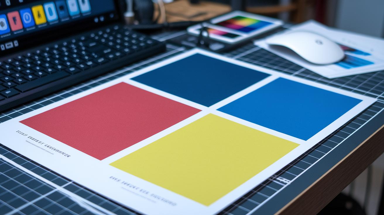
Color in film posters acts like a silent storyteller. Designers carefully choose each hue to spark a feeling before any words hit your eyes. Bright colors can hint that the film will be lively and full of energy, while softer tones might suggest a thoughtful or quiet mood. This quick color cue helps you connect with a film's vibe right away.
Take red, blue, and yellow for example. Red often tells you to expect intensity or conflict with its punchy energy. Blue casts a calming, sometimes sad tone that feels both reflective and mysterious. Yellow and gold evoke warmth and nostalgia, giving a nod to retro or sentimental moments. These color choices serve as instant hints about the film's themes.
Even tiny changes matter. A boost in brightness can signal rising stakes or dramatic turns, while a lower contrast creates a softer, more reflective feel. These adjustments help guide your eyes, marking shifts in the story and deepening the overall visual impact.
Typography in Movie Poster Art: Genre and Narrative Signals
Font style sets the mood for a film. A horror movie might use rough, scratchy letters to suggest fear, while a romance poster favors soft, flowing scripts that feel warm and inviting. A thriller can use spiky, pointed fonts to quickly build a sense of urgency and tension.
The size, spacing, and order of text help guide your eyes. Big, bold titles show the main idea of the film, while smaller taglines add extra details. This smart layout tells you what to expect and builds excitement without any fuss.
Colors and textures give the text extra punch. Bright neon or shiny metallic colors can push a futuristic vibe, while weathered finishes and gentle gradients hint at a story set in a different time. These design choices work together to create a visual language that hints at the film’s tone and style.
Composition and Symbolism in Movie Poster Art: Case Studies
Movie posters are more than just pictures. They act like puzzles that hide hints about the film’s true nature. Simple images and clever layouts invite you to look for hidden clues. A lone silhouette or a clever use of blank space might suggest a growing danger or a layered story, drawing you into a playful search for meaning.
| Poster Title | Key Visual Symbol | Narrative Clue |
|---|---|---|
| Jaws | Shark fin silhouette | Underwater threat |
| Inception | Folding cityscape | Layered realities |
| Spirited Away | Mystical bathhouse | Journey into spirit world |
These designs set the tone for the film. They use just enough imagery, like a shark fin hinting at hidden danger or a bending city that plays with your sense of space, to stir interest long before a word is spoken onscreen. Each detail encourages you to take a closer look, revealing hints about the film's genre and underlying themes, and turning the poster into an interactive experience.
Case Study: “Jaws” Poster
The “Jaws” poster relies on simple imagery. A bold shark fin is set against a vast, empty space. This choice makes the threat seem both real and near, sparking curiosity about what lies beneath.
Case Study: “Inception” Poster
This poster shows a city that appears to fold in on itself, placed within the outline of a human head. This image speaks to layers of reality and shifting perspectives, mirroring the film’s complex narrative in a single, striking graphic.
Case Study: “Spirited Away” Poster
The “Spirited Away” poster features a traditional bathhouse, hinting at a magical journey. It blends cultural elements with a mysterious spirit world, inviting you to step into a land filled with wonder and myth.
Poster Art across Genres and Cultural Contexts
Movie posters use well-known cultural symbols to speak directly to their viewers. Designers often add familiar icons, like classic Japanese images or historic emblems, to quickly show a film's cultural roots. These visual hints help people connect with the film and set their minds on the story and the characters.
Each film genre has its own style. For example, film noir (a style famous for dark visuals and mystery) uses stark black-and-white contrasts and deep shadows to build suspense. Romantic dramas, on the other hand, choose soft pastels that feel warm and gentle. Action movies burst with bright colors and dynamic layouts to show energy and movement. These style choices guide viewers on what to expect from the film.
Indie posters often come from directors who work with tight budgets yet create a striking look. They play with unusual color choices and quirky design elements that quickly become their signature style. This approach makes these films stand out from the big-budget blockbusters.
Framework for Decoding Movie Poster Art Visuals

This checklist is your go-to guide for spotting key details in movie poster art. It combines a look at colors, layout, text style, and symbols with extra insights from fan chats and director styles. Use it to quickly catch a film's vibe and hints about its story.
- Step 1: Look at the main colors and the overall feeling they give.
- Step 2: Find the main images and any symbols that stand out.
- Step 3: Check the style and placement of the text for clues about the genre.
- Step 4: Look up the film's background and the director’s unique style.
- Step 5: Peek at fan discussions to uncover hidden details.
Final Words
In the action, we broke down how a movie poster’s design teases a film's story. Each section, from color and typography to case studies and decoding frameworks, showed how strategic visuals hint at genre and mood.
This guide helps busy moviegoers spot visual clues quickly and confidently. Enjoy exploring understanding movie poster art: what visual clues reveal about films, and let these insights boost your next film pick.
FAQ
What are the 10 types of movie posters and different categories?
The 10 types include promotional, teaser, character, event, block, contest, digital, limited edition, artwork-focused, and alternative designs. Each type uses visuals that hint at the film’s mood and narrative.
What is a movie poster called?
The term “movie poster” is often interchangeable with “film poster.” It acts as a visual teaser that conveys a film’s tone, style, and key themes through its design.
What is a movie poster elements template?
The template for movie poster elements typically outlines design parts such as composition, color, typography, imagery, symbolism, layout, and balance, all of which work together to represent the film’s story.
What are the 7 elements of a great movie poster design and its features?
The seven key elements include clear composition, defined color scheme, effective typography, engaging imagery, distinct symbolism, proper layout, and a balanced design that signals the film’s theme.
What are the visuals of a movie poster?
The visuals of a movie poster consist of imagery, color choices, graphic elements, and well-arranged text that together communicate genre, mood, and a hint of the film’s narrative.
What are 6 important things that must be on a poster?
Six essential items include a captivating image, a strong title, clear typography, a concise tagline, key visual symbols, and a balanced layout that engages and informs the viewer.


