

Ever wonder why classic movie posters still catch your eye? They mix bold images with clear, striking text to instantly show a film's vibe. These posters work as both art and advertisement, turning a single picture into a mini story that tugs at your emotions.
In this piece, we'll break down what makes these designs stand out. You'll see how large portraits of film stars, clever color choices, and smart layouts all work together to create a look that still rocks the world of film marketing.
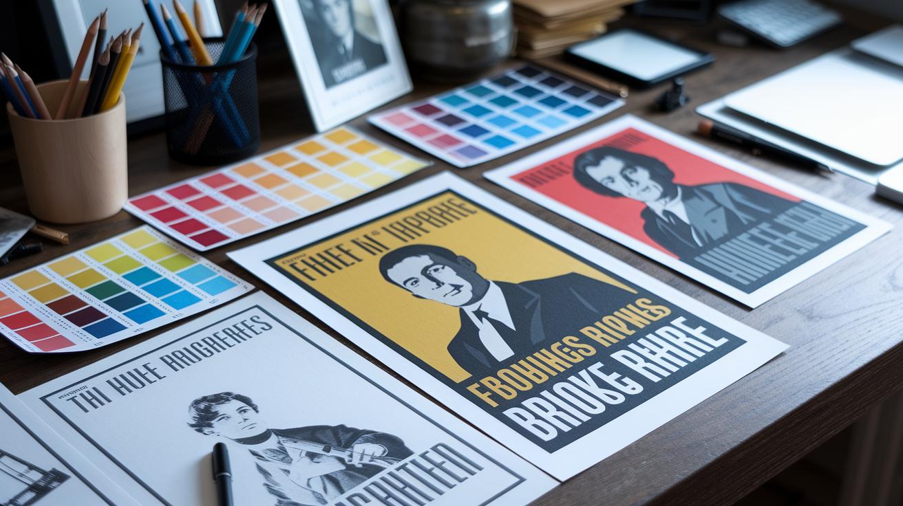
What Makes Classic Movie Posters Iconic and Effective
Classic movie posters grab your attention and spark curiosity in a way few other designs can. They work as both ads and art, capturing a film’s mood in a single glance. In the Golden Age, posters came in a 27×40-inch format and often featured a star’s portrait with big, bold text to stand out. Today, those ideas still shape film marketing by mixing creative style with clear storytelling.
Their charm comes from showing a film’s heart with one striking image. A great poster can sum up a movie’s story in a snapshot, drawing you into the world of the film before you even sit down to watch it. This visual storytelling turns each poster into a piece of film history.
- Central image that highlights the lead star or a key symbol
- Simple color schemes that make an immediate impression
- Clear text layout that showcases the title and tagline
- Small icons or symbols hinting at the movie’s genre
- A balanced design that naturally leads your eye
Every part of the design works together to make the poster effective. The main image gives you a clear focus, often highlighting the movie’s star or an important symbol. Bold colors and clear text create a smooth flow that directs you from the title to the tagline. Simple symbols hint at the film’s style, while a balanced layout pulls it all together. This mix not only makes the poster memorable but also turns it into a mini story of its own. Just like the 1927 Metropolis poster, a great design can spark interest right away with one powerful image.
Historical Evolution of Classic Movie Posters
In the early 1900s to 1920s, movie posters were simple text ads that highlighted the studio’s name more than the film itself. They relied on clear messages with bold lettering and very basic designs, almost like industrial notices.
The 1930s to 1940s introduced illustrated one-sheets. Artists focused on the stars, creating dramatic images that mixed pictures and words to capture the glamour and mystery of movies.
By the 1950s and 1960s, designers began using color printing and simple layouts. They played with bold fonts and abstract images to tell a film’s story quickly. For instance, Saul Bass used simple shapes and bright colors to stir deep emotions with very little detail.
In the 1970s and 1980s, during the Blockbuster Era, posters grew more detailed. They featured big, painted visuals meant to grab viewers’ attention at once, much like the epic feel of films such as Star Wars.
Since the 1990s, digital photography and graphic software have joined forces with traditional art. Today, movie posters are clean and shareable, perfect for social media while still hinting at their vintage roots.
Core Design Principles of Classic Movie Posters
Classic movie posters are not just eye candy. They carry the film’s personality and show off the style of their time. Modern design tricks focus on using fonts and styles that match the era. For example, vintage fonts remind us of the film's period and help build its brand. Fun fact: before Alfred Hitchcock became famous, he used poster images to hint at the hidden tension in his movies.
Design also borrows ideas from history. Elements like bold silhouettes from mid-century thrillers or lively layouts from the 80s add extra layers that shape how we see a movie. The table below breaks down some key design features and what they do:
| Design Principle | Description |
|---|---|
| Central Focus | Iconic images or symbols that define the film |
| Visual Hierarchy | Text arranged to balance the brand message and guide the viewer |
| Color Contrast | Color choices that set the mood and fit the era |
| Typography Style | Unique fonts that build the movie’s brand and reflect its time |
Designers mix these ideas to give each poster its own story. They use fonts not just to be clear but also to evoke the film’s cultural moment. Likewise, using images that match a specific era helps set the mood and prepare the audience without relying on basic poster designs.
Case Studies: Most Iconic Classic Movie Posters

Metropolis (1927, Schulz-Neudamm) draws you in with its bold Art Deco look that hints at a high-tech future. Its rarity, only four copies exist, with one selling for nearly $1.2 million, shows how a single image can capture technological optimism.
Vertigo (1958, Saul Bass) opts for abstract spirals and clean, simple shapes. This poster communicates a swirl of obsession and dizzying emotion. Designers have loved its understated style for decades.
Star Wars (1977, Tom Jung/Drew Struzan) broke the mold with a hand-painted scene of heroes set against a vast galactic background. This artwork not only sets up an epic adventure but also inspired many of the visual shortcuts seen in blockbuster films today.
Jaws (1975, Roger Kastel) creates immediate tension with a stark image: a lone swimmer framed by a lurking, menacing shark and a striking tagline. Its design is a masterclass in sparking fear with simple visuals.
Pulp Fiction (1994, John Alvin) mixes retro fonts and pops of red for a modern yet old-school feel. The bold silhouette creates an edgy story all on its own that matches the movie’s cult vibe.
The Silence of the Lambs (1991, Jesse Griffin) uses a skull-butterfly image to hint at hidden depths. This symbolic design pushes viewers to look for layers of meaning behind the movie’s surface.
Each poster tells its film’s story in one eye-catching image, proving that sometimes a single design is all it takes to spark conversation and capture the spirit of a movie.
How Classic Movie Posters Shaped Film Promotion
Classic movie posters did more than just advertise films. They used bold images to spark excitement long before trailers took over. The National Screen Service made sure every theater lobby had the same clear look, so each poster built a strong film identity. Catchy taglines like "Don't go in the water" from Jaws worked with the visuals to grab attention and get people talking.
This approach helped film marketing in a few ways:
- One-sheet branding kept the look the same in every theater.
- Memorable taglines gave viewers quick, catchy clues about the film.
- Strong visuals built buzz way before digital previews existed.
By mixing eye-catching art with clear messages, these posters became the heart of film promotion. They set off creative advertising campaigns that pulled audiences into theaters time after time. Each poster was like a mini event, an honest snapshot of what the film promised, that changed how movies were talked about for many years.
Classic Movie Posters: Cultural Impact and Collectibility

Vintage posters are much more than old film ads. Today, they are cherished collectibles that carry real cultural weight. Over the years, these designs have come to stand for whole movie eras while capturing the creative and commercial spirit of their times. Factors like rarity, condition, and details such as NSS numbering can push auction prices very high. For example, the Metropolis poster, with only four copies known, once sold for nearly $1.2 million, showing that these items are far more than simple promotional tools.
Collectors also value posters based on regional versions like the US One-Sheet and the UK Quad. These design differences affect both how they look and how much they’re worth. Keeping these posters in good shape has become an art. Methods like professional framing, careful restoration of prints, and verifying original copies help preserve these cultural treasures. Fans and collectors take great care to maintain them, keeping a solid piece of cinema history safe for the future.
- Quality, rarity, and NSS numbering
- Differences in regional versions (US One-Sheet vs. UK Quad)
- Expert framing and restoration techniques
This mix of striking visuals and rich history keeps classic movie posters as beloved keepsakes and clear markers of film eras.
Final Words
In the action, we broke down how design elements, historical eras, and visual storytelling form the backbone of classic movie posters (most iconic and why they work).
We saw how central imagery, bold colors, and creative typography set the stage for memorable film marketing.
This article has unpacked key attributes that make these posters enduring collectibles and powerful promotional tools.
Keep this checklist in mind as you spot designs that not only promote films but also capture the magic of cinema history.
Happy viewing and collecting!
FAQ
What are the 100 best movie posters of all time?
The idea behind the 100 best movie posters of all time is that they blend timeless design, striking imagery, and clear typography to instantly capture a film’s essence and draw viewers into the experience.
What are the best movie posters of the 21st Century?
The best movie posters of the 21st Century typically mix modern digital design with classic elements, using clean layouts and vibrant graphics that not only grab attention but communicate the film’s mood quickly.
What are the 25 best movie posters ever?
The selection of the 25 best movie posters ever highlights designs known for their iconic visuals, engaging taglines, and balanced composition that successfully encapsulate the film’s theme and generate curiosity.
What are the most creative movie posters?
The most creative movie posters stand out by reimagining traditional design elements with inventive imagery and unexpected layouts, resulting in artwork that captures attention and sparks interest in the film.
What are the best movie posters of the 2000s?
The best movie posters of the 2000s skillfully merge digital and hand-drawn elements, featuring bold color schemes and striking typography that effectively communicate a film’s narrative and draw audiences in.
What are the best movie posters of the 2020s?
The best movie posters of the 2020s focus on clean, shareable designs optimized for social media, using modern typography and fresh visuals that immediately convey the film’s style and story.
What are the best posters of all time?
The best posters of all time are celebrated for their enduring style, combining clear visual hierarchy, impactful imagery, and concise messaging that have defined successful film marketing over the decades.
What are some movie poster ideas for a school project?
Movie poster ideas for a school project can include using a strong central image, limited yet bold color palettes, and creative typography to tell a mini visual story that resonates with the intended audience.


